 How does your website look on your phone or tablet? Go ahead and check…Did you have to zoom in to read the content or access the navigation menus? If so, your website is not optimized for mobile devices and losing you business. This is because search engines such as Google are now penalizing sites that do not provide a good user experience on mobile phones and tablets.
These days, people are searching and browsing websites using all kinds of devices from cell phones & tablets to appliances and game consoles.
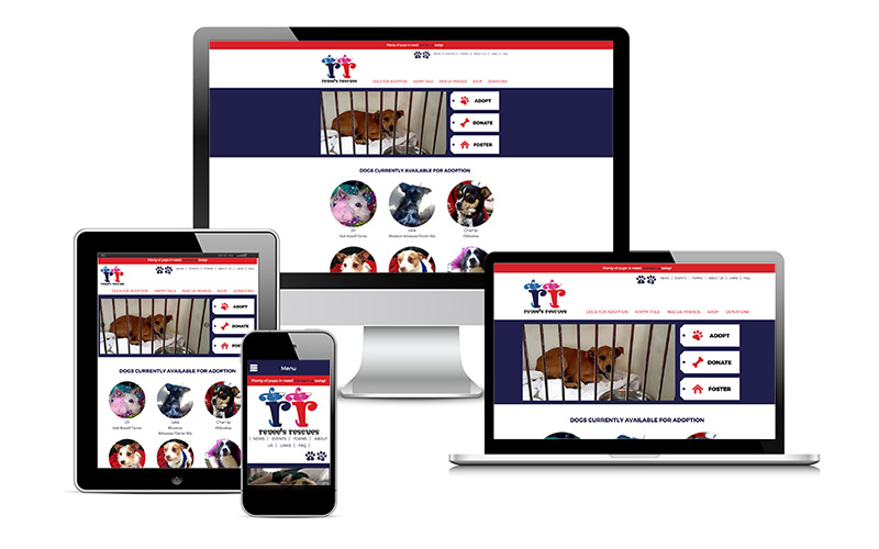
Responsive web design will ensure the visitor enjoys the same awesome experience on their phone or tablet as they do on their desktop computer. No need to manage separate sites specifically for mobile. By detecting the device width, we can adapt the layout of the site for multiple device sizes. This can be visualized by viewing a website on a desktop computer and simply resizing the browser window to a narrow width. If you’re reading this on a desktop computer, try it out right here. If you make the window narrow, like a phone display, you’ll see how the menus collapse, font sizes increase, and the sidebar drops down below the content.
Request a free estimate to update to responsive design today!